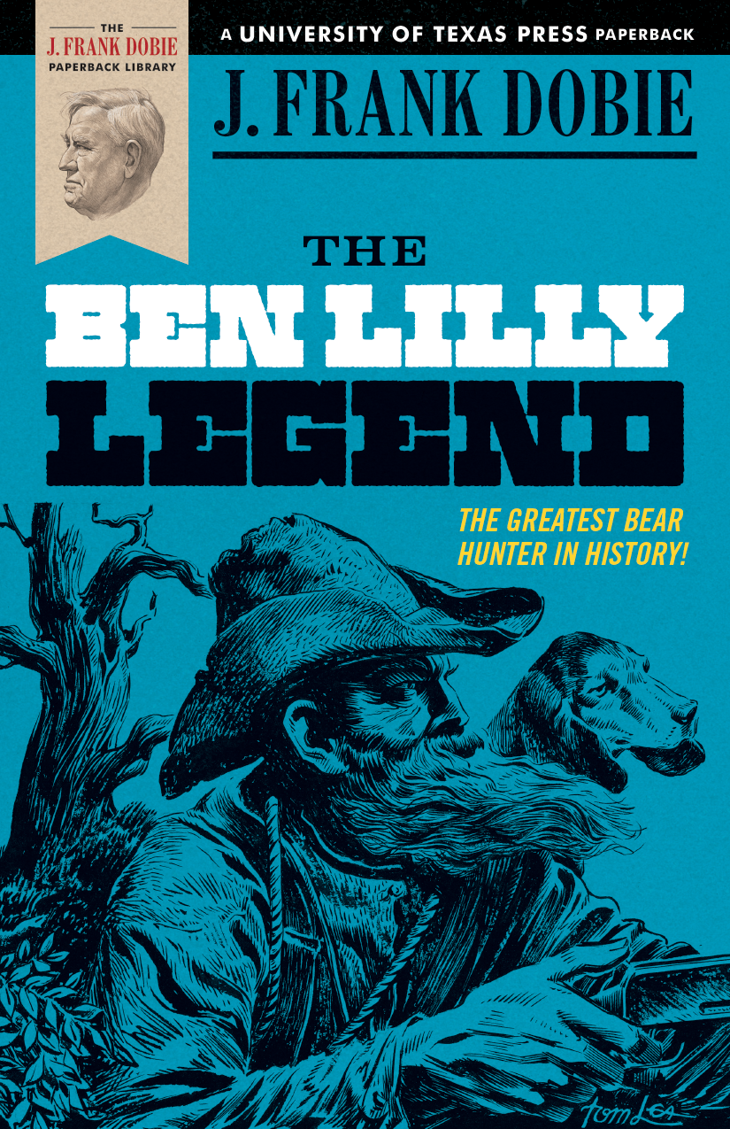
In 1975 the estate of J. Frank Dobie (1888–1964) established an endowment that would allow the University of Texas Press to keep his books in print for decades to come. Forty years later, the arrangement is still in place, and the press annually sells thousands of copies of eight of Dobie’s best-known works. Hoping to gain a new generation of readers for the legendary folklorist, the press recently redesigned the books’ covers in a manner that evokes the past while keeping an eye on twenty-first-century sensibilities—they’re at once folkloric and pop, vintage and postmodern, so old they’re new. Six of these revamped editions have already been published, with two more to come this year. Here’s a peek behind the scenes of the visual overhaul of the most recent release, The Ben Lilly Legend.
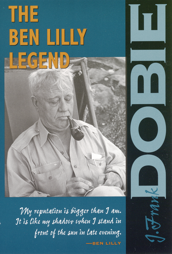
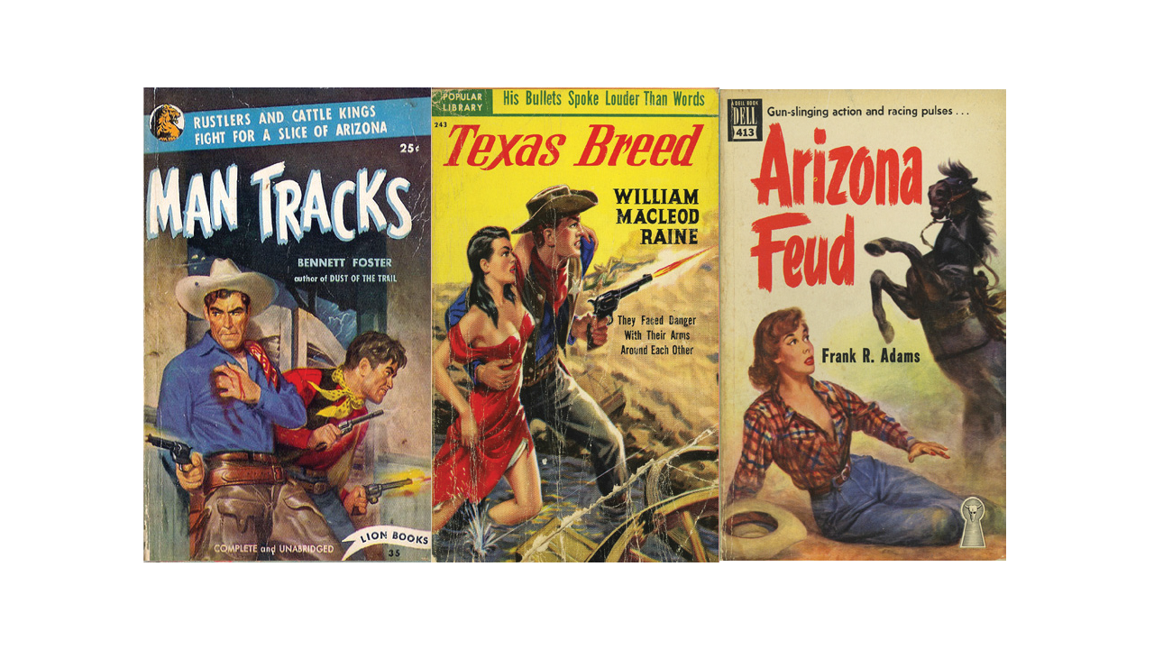
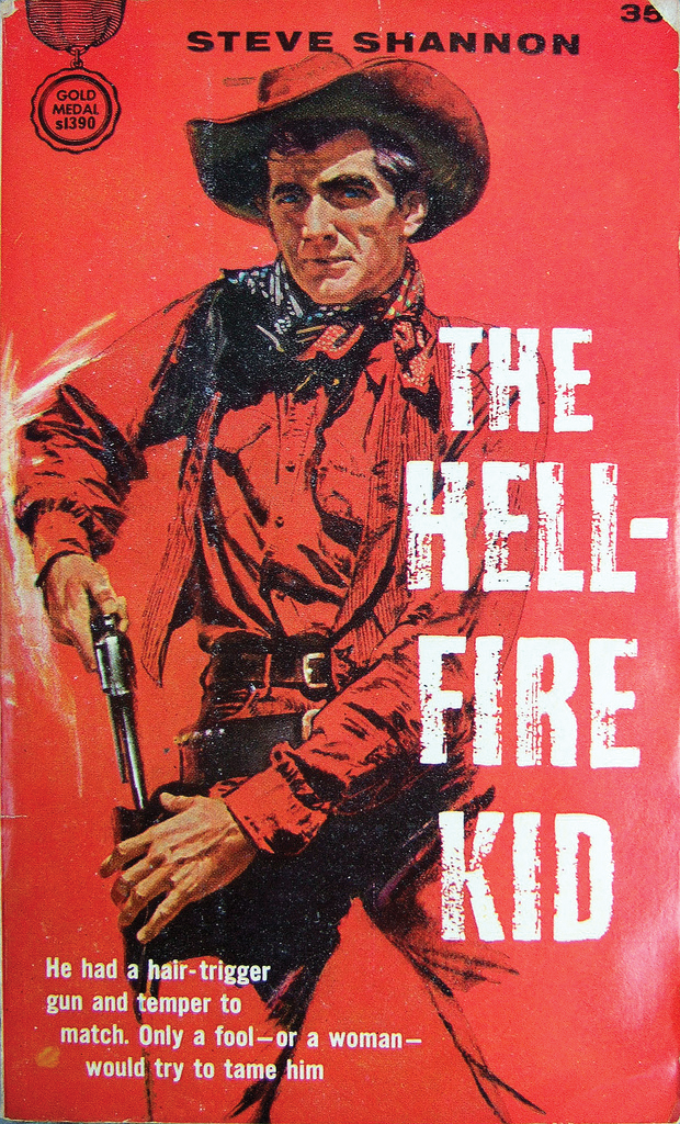
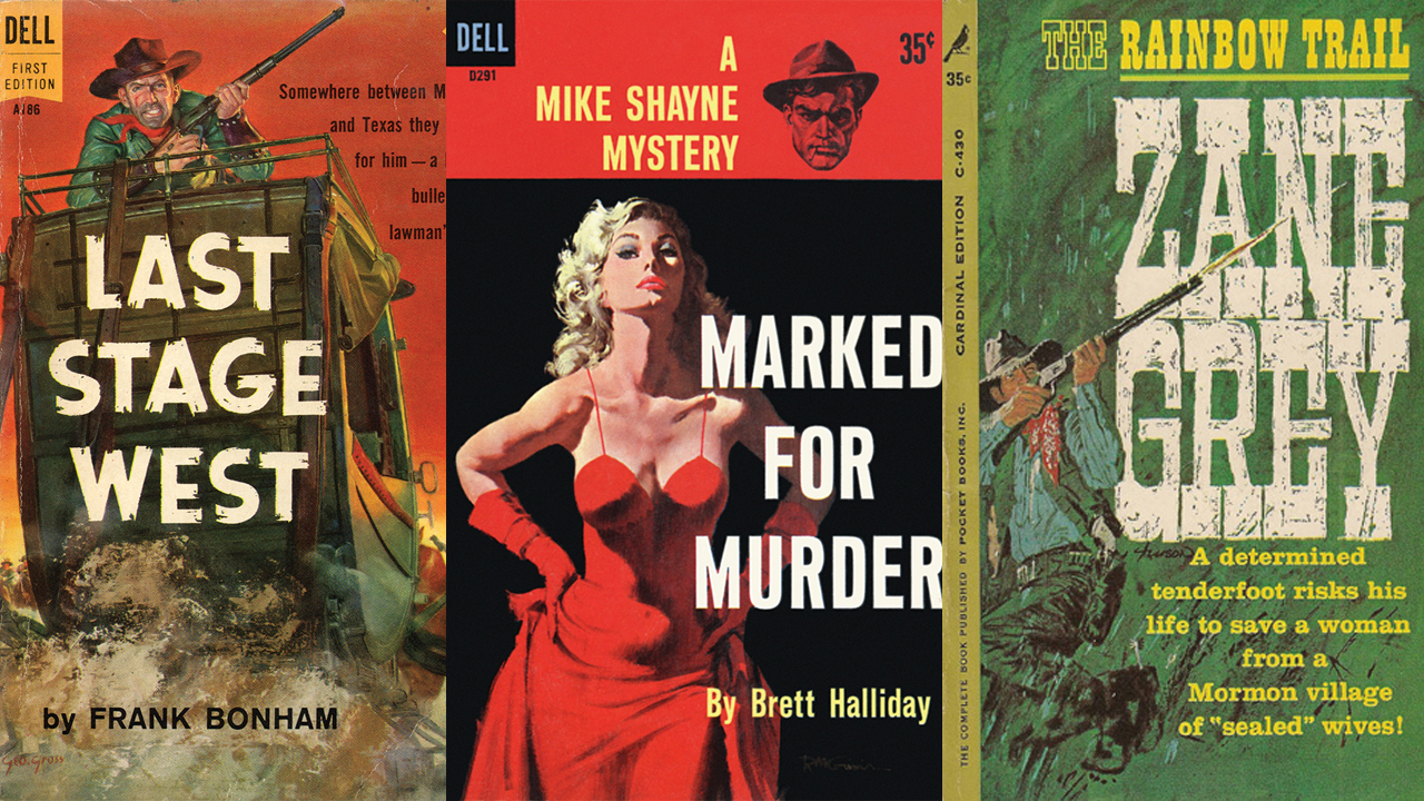
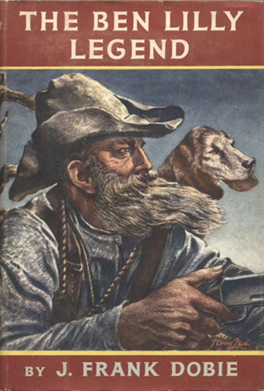
In 1981 UT Press published its first edition of 1950’s The Ben Lilly Legend. Like all the Dobie books the press put out at the time, its cover featured the author’s name, a negative-space longhorn, and a black and white illustration, set against a muted background—a respectful if not particularly dynamic treatment.In the early 2000’s, as the press’s stock of Dobie books was running low, it completely redesigned the covers, this time emphasizing photographs of Dobie himself.Two years ago, when stock was running low once again, UT Press designer Derek George was asked if he’d like to try his hand at refreshing the series. “It sounded like a lot of fun,” George says. “And before I had put much thought into it, a sales rep here named Chris Hoyt showed me a picture of an old western pulp paperback and said, ‘What do you think about this kind of direction?’ And I immediately thought, ‘Oh, yeah, that makes perfect sense.’ ”At first, George figured he would commission original artwork for each book in the lurid style of those vintage paperbacks. But when that proved to be exorbitantly expensive, he decided to repurpose the line art from inside the books, many of which were copiously illustrated. For a while, though, he couldn’t figure out how to do that and capture the pulpy western vibe he wanted. Then, while perusing images posted by the Wild West Pulp group on the photo-sharing website Flickr, he spotted the cover of a decades-old paperback called The Hell-Fire Kid. “That one really broke it open for me,” he says. “It’s not quite monochromatic—the face and hands are in skin tones—but the rest of it’s red, and I thought, ‘I can do something like this.’ ”George started working on a template for the entire series, borrowing liberally from his pulp source material. The “J. Frank Dobie Paperback Library” ribbon near the upper-left-hand corner of each book is a close cousin of the old “Dell First Edition” ribbon. The inclusion of a Dobie portrait inside the ribbon—drawn decades ago by the Texas artist Tom Lea—was inspired by the “floating head” on the once popular Mike Shayne mystery series. For the titles, George tried to capture the feel of the old westerns, though not the precise typefaces. Each book got a different treatment; for Ben Lilly he settled on Zennat Pro, which reminded him of the chunky lettering on Zane Grey’s The Rainbow Trail.
Finding a cover image for Ben Lilly was tough, because there weren’t that many illustrations inside the book. At first, George worked with a picture of a knife, which he thought had a stark, iconic quality. But he wasn’t satisfied with it, so he sought inspiration at UT’s Harry Ransom Center, which houses much of Dobie’s archive.
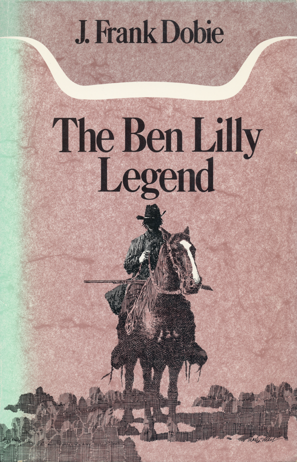
There, he discovered a first-edition copy of the book, which featured a Tom Lea cover portrait of Lilly that hadn’t appeared in any of UT Press’s editions. “When I saw that, it was kind of obvious,” says George. “Hands down it was the winner.”