One of the odder aspects of Texans’ outsize state pride is that we’re very fond of the shape of Texas itself; you can’t drive a mile here without passing a tax preparation office or vehicle inspection station that incorporates that iconic figure into its logo. In fact, one would imagine that, when it comes to logos, Texas has the most popular state outline in the country. But is it possible to prove that?
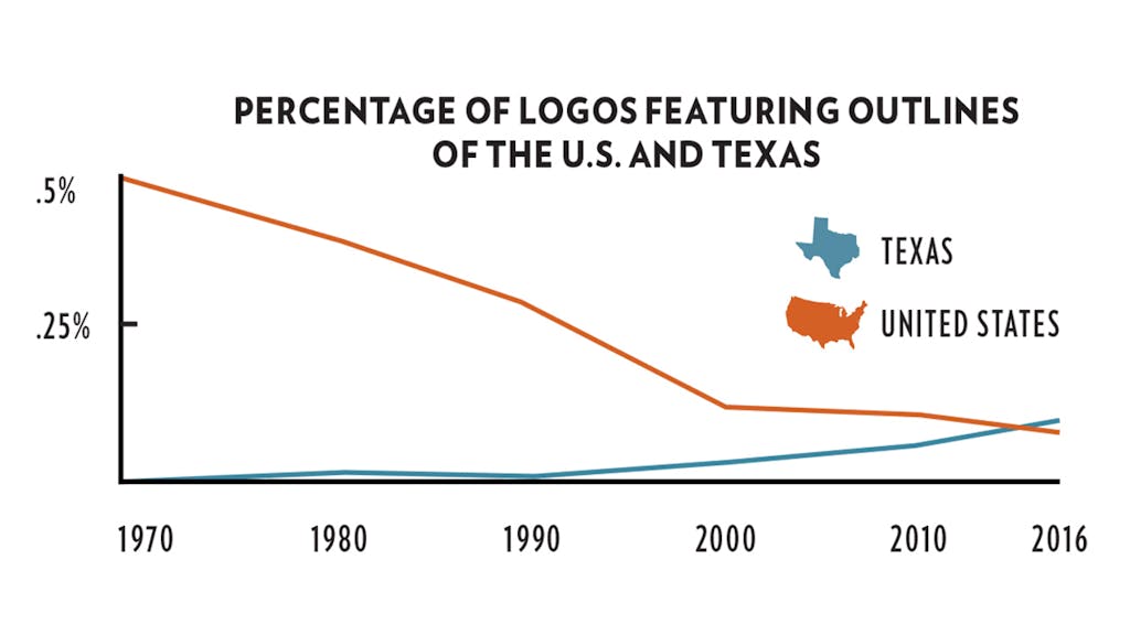
In fact, it is. By examining United States Patent and Trademark Office data, we can see that not only do Texas-shaped logos come out on top, there are more than twice as many of them as of our nearest competitor, California (see pie chart). What’s more, as the line graph below demonstrates, in recent years the percentage of new logos featuring the shape of Texas has surpassed that of logos depicting the outline of the United States itself.
Armin Vit of Austin graphic design firm Under Consideration explains Texas’s appeal:
One attraction is that it’s almost a square proportion, so it serves as a great canvas with a lot of room to play in. It’s also interesting because most of the other states are rectangles, without many distinguishing features. California and Florida are as distinctive as Texas, but California has such a slender shape that it’s hard to play with, and Florida—well, look at it, there’s nothing pleasant about the shape. Texas can also be used small, almost like a punctuation mark, and still be recognizable. If you shrink California or Florida, it looks like a printing error.
The funny thing is, it’s really not a conventionally good shape. Like, what’s the deal with the 90-degree angles in the Panhandle and West Texas when everything else is the contour of the worst ginger root you’ve ever seen? Still, it’s the most badass state shape in the U.S., no doubt.