Walker Lukens is primed for a good year. He spent much of 2018 focused on writing songs from the perspectives of other people—specifically, from those he encountered as part of his “Song Confessional” series, in which he’d invite people into a mobile recording studio to tell him (or a rotating cast of other artists) their secrets and record a one-of-a-kind single for them based on their answers. “I got away from wanting to make art that was very meaningful to myself,” he says. “With the song confessional . . . I got to work on songs that I know mean something to someone.” That sense of purpose revitalized his songwriting and informed his new album, Adult, out April 26.
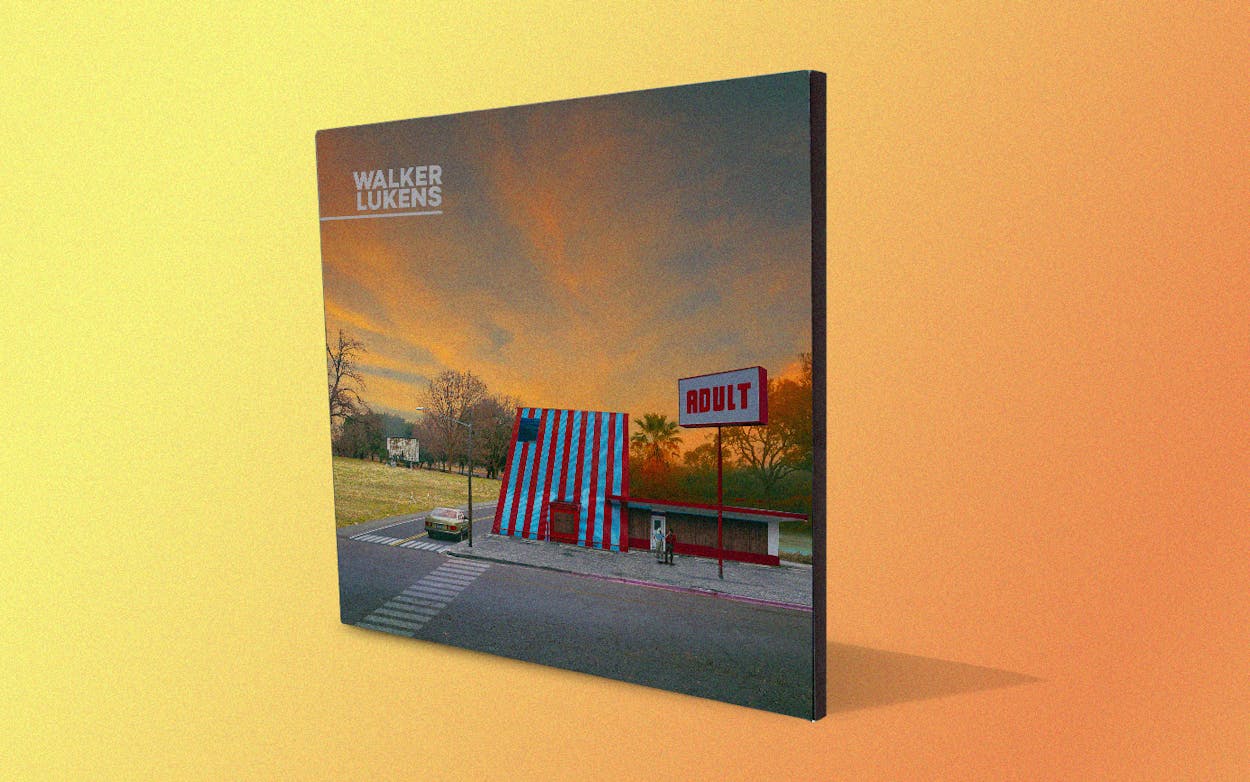
On Tuesday, Lukens teased the album cover on his Twitter account. The result is a striking, evocative image full of rich, dusky hues—and it also features a big building that looks suspiciously like a Whataburger. Texas Monthly caught up with the musician ahead of his SXSW appearance and subsequent tour to learn more about the intriguing image that suggests the slow passage of time, the cyclical nature of life and death, and Honey Butter Chicken Biscuits.
Texas Monthly: Where did the album art for Adult come from?
Walker Lukens: The art was made by a guy named Scott McCormick. He made several composite images. If you look at the album art and then the tour announcement, he made a bunch of different images that are all connected.
TM: Did you commission the pieces, or were they things he had already created that you saw and fell in love with?
WL: I saw some of his older stuff and wanted to do an album with him. He does a lot of stuff, and he’s worked with a lot of musicians. I knew I wanted to commission something for this record and do something a little more conceptual and grand than I had ever done before. Scott is really good at that kind of stuff.
TM: Where did the giant Whataburger-like building come from?
WL: [Laughs] That is not a real building that you see there. That cover image is composited together from several different things. In the image, the field is from one place, the road is from one place, half of the building is from one place, and the other half is from another. It’s not a Whataburger, but it sure does look like the A-frame from one, doesn’t it?
TM: Why did a composite image appeal to you?
WL: I wanted to do something that was unique for the record, something that didn’t exist anywhere else. One thing I battle against, playing under my own name, is that there’s this assumption with a singer-songwriter that you’ll be folky and confessional. I think being a guy named “Walker” in Texas makes it doubly so. People think you’ll have an acoustic guitar and sing about Pawpaw and stuff, which I don’t really do. I think of the artwork as a way to set the tone—I wanted this record to feel a little bit surreal, and Scott is so good at that stuff. If you look at his work, the album artwork he created almost looks like a diorama.
TM: So where did the thing that looks like a Whataburger but isn’t come from?
WL: The root idea for the artwork was to show one street corner changing over time. Scott’s idea was that something should turn into an adult bookstore. The way his process works, he has to use photos of a building at a certain angle so he can put it together with other stuff. I had no idea what was going to turn into an adult bookstore until I saw it. He had talked about a million different ideas.
TM: Have you thought about what you’ll do if you get a cease-and-desist letter from an orange-and-white-striped restaurant?
WL: Well, I wrote a song for the head of their marketing department through my song confessional last year, so I hope he’ll do my bidding if someone decides to sue me. But I sure hope they just like it.
This interview has been edited for clarity and length.


