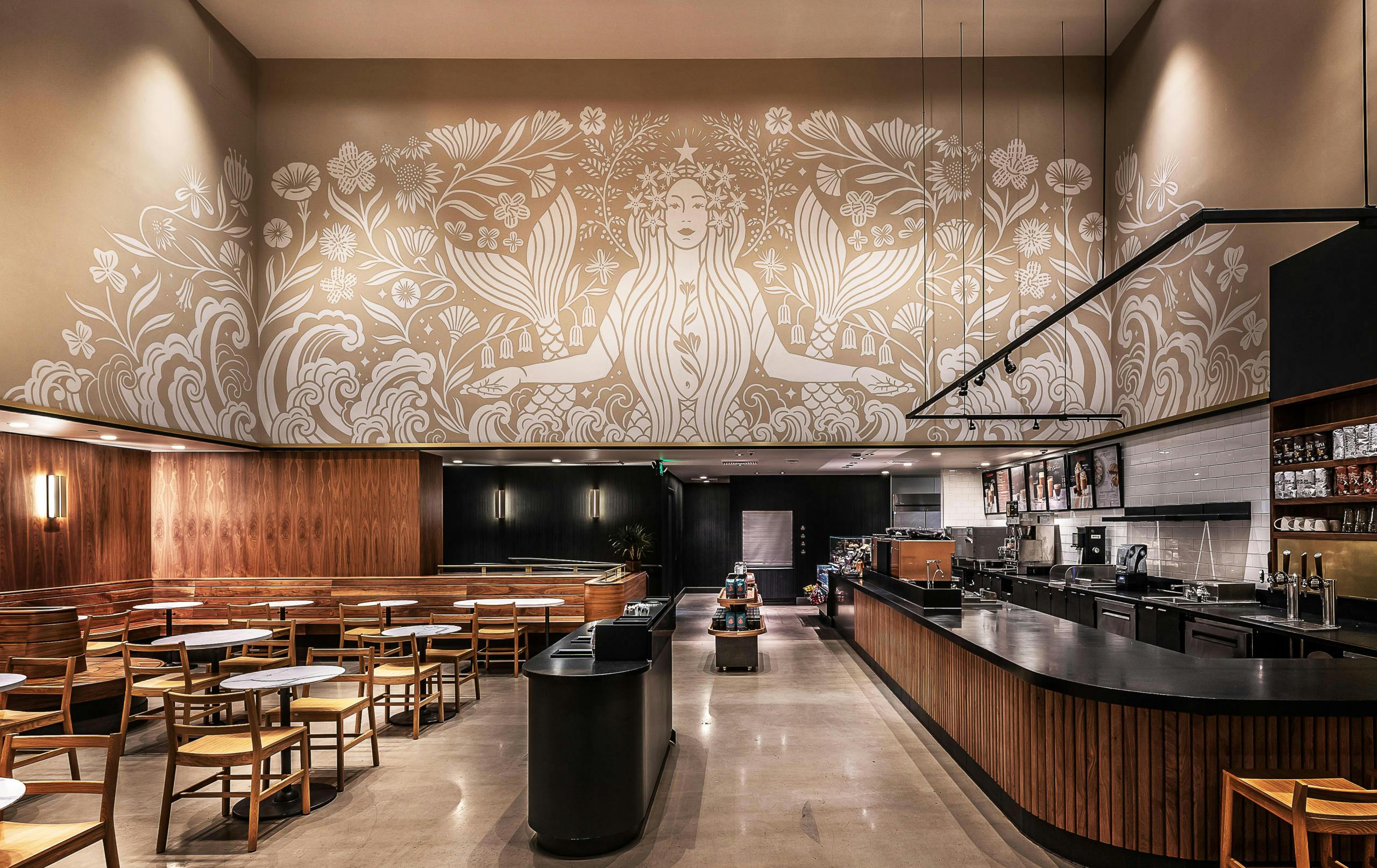
Dana Tanamachi became enamored with the art of lettering while taking a typography course at the University of North Texas. “I was obsessed with it,” she says. “I didn’t know you could be good at something like this and make a living filling letters.” A few years later, the native Houstonian launched her career with a piece of chalk and started her own boutique design studio, racking up clients such as Starbucks, H-E-B, SXSW, and the Obama Foundation.
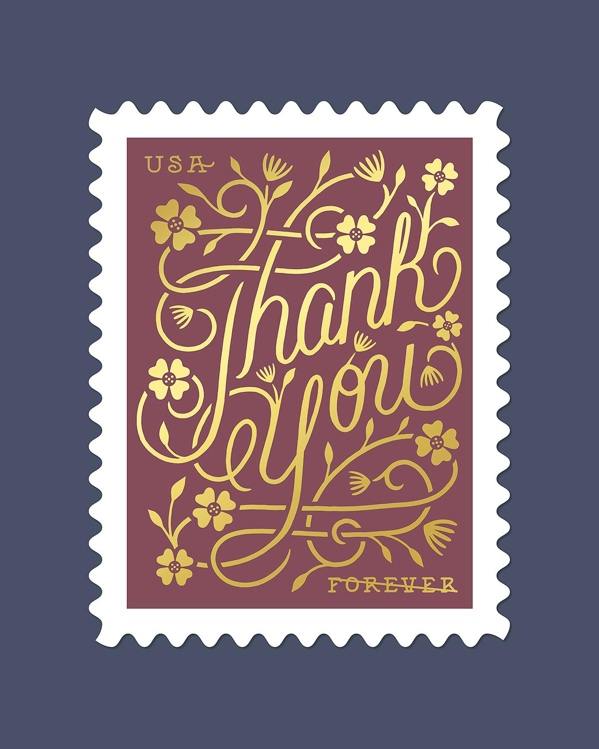
One of her most recent works is one you can easily purchase: a “Thank You” stamp made for the U.S. Postal Service and released on August 21. Texas Monthly spoke with Tamanachi, who now lives in Brooklyn, about how she got started as a typographer, keeping her passion from becoming rote, and the Texans who inspire her.
On how the history of lettering has informed her design
When I went to New York in 2008, my first job was at an agency that designed a majority of the Broadway show posters. We were working on these new posters that would be in Times Square and on taxicabs. We’d need a type treatment for the title and they’d ask me to take a shot at it. That’s kind of how I started to hone my skills. The great thing about designing for Broadway is that you’re doing so many different eras—you could be designing like a Roaring Twenties ragtime show, and then you might be doing a really groovy sixties or seventies show, or a Victorian one, or something futuristic. That was a great lab to test my knowledge of art and design history and build up a strong mental library.

On launching her typography and lettering career
In 2009, I went to a housewarming party in Brooklyn, and I remember walking in and seeing this wall that was all black and was like a chalkboard. This was pre-Pinterest and was new to me. My friend asked me to draw something on it and I drew the word Brooklyn. My friend was like, “Wow, that’s awesome. Will you take my picture in front of it?” I didn’t think it was that special, but it became a photo wall for that party. A couple of our friends put it on social media, and it was through that and the support of my friends that I got my first commissions.
I think it was the right place at the right time. That whole vintage aesthetic was becoming super popular in Brooklyn at the time. I was just so shocked and surprised when people started contacting me for commissions. Over the next couple of years I did a cover of Oprah and the cover of Time, and covers of children’s classics for Penguin Random House.
On switching from chalk art to a different medium
In 2013 or 2014, I started thinking, what an incredible opportunity it’s been in the last years, but to be honest, I have a lot more within me that I want to try. And so I kind of quit cold turkey and decided one day I wasn’t going to do it anymore. I remember someone had asked me if I went to college for chalk art. People were introducing me as Dana the chalk artist. I just thought, “Man, I never meant to really become that.”
I was really torn because, again, I get to create art for a living. That’s something I don’t take for granted. But at the same time, I didn’t want to be stuck with this one thing that ends up being soulless and know that my heart’s not in it anymore. I still stayed busy, but I was saying no to a lot of stuff. The phones were quieter for a couple of years, but I was okay with it. I just took that time to practice and to make more work that I wanted to be making.
 In 2017, I did this large project called the ESV Illuminated Bible. I did over five hundred illustrations in gold, it’s very ornate. And it took me about a year to do it. When I see that, I’m really glad I took that time away from regular work to do something like this.
On the stamp’s design
Growth and unity are what I was thinking about. I knew I wanted a lot of connecting lines, for it to overlap and interlock, for it to feel like one thing. And there are floral elements to it too.
I hope they do have a timeless feel. It feels so classic and it doesn’t feel super trendy, so hopefully it will stand the test of time.
On Texan artists who inspire her
I really love the work of Gabriel Dawe—he’s in Dallas and creates large-scale art installations. He uses rainbow hues and floor-to-ceiling string so it just looks like a ray of light. It’s incredible. I’ve been following his work for years. I also love Dan Lam. She had a little show in the East Village a couple years ago. I stopped by and was just so delighted by her little drips and blobs. I got a really up close and personal experience with her work, getting to see the crazy colors and shapes. I’ve seen them online before, but seeing them in real life was really a delight.
In terms of music, my summer album has been Khalid’s Free Spirit. I’ve become obsessed with that album. It’s always on if I’m in a car or when I’m working, and I was really excited to learn that he was from Texas—that made me super proud. And just the last two weeks I got into this album by Conan Gray. I love pop music, so I think it came up on a Spotify playlist, but the album’s called Kid Krow. And he’s another half-Japanese Texan. I was like, what are the odds? This is so cool. It’s really rare to run into someone like that in New York. And so I started listening to his album and really love it. That has been on repeat with Khalid this summer.

On the release of her postage stamp
I think that the timing is incredible. It’s very significant to me. The post office has been in the news over the last couple of weeks, and the fact that the stamp is coming out now is great. because I love the fact that it’s something that people can buy that can truly, practically help support the USPS. When I first designed this stamp in 2015, I envisioned that a bride would use it to write thank-you letters for their wedding gifts and things like that. And I think they still will, but in 2020, “Thank you” holds a completely different meaning and completely different weight.
When you think about all the things we’ve been through in 2020 already—in January, we were saying thank you to the firefighters fighting the Australian wildfires. Then we were saying thank you to essential workers and to doctors and nurses. Then we’re joining in and saying thank you to protesters who are standing up for civil rights, for Black lives. And then now, saying thank you to U.S. postal workers. I think by purchasing it, we are saying, thank you, we want you to stay in business. We want people to have jobs. We want our mail and our ballots to be safely delivered. Hopefully this stamp is a good reminder to say thank you to all the people that we have to be grateful for.
- More About:
- Art


