


If you live in Big D, it’s relatively well known that South Dallas is a less wealthy part of the city than North Dallas. Or if you call the capital city home, you know that East Austin has historically been poorer than the west side of the city. But when the San Antonio Express-News mined Census data from 1990, 2000, and 2012 to track the way that wealth and income distribution in various Texas cities has changed during the state boom of the past couple of decades, we learned some fascinating things.
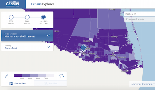
The methodology used by the Express-News is explained here:
Using the U.S. Census Bureau’s Census Explorer tool, we mapped the income by census tract in some of the biggest cities in Texas and looked at how those areas changed from the 1990 Census to the 2012 American Community Survey — with the 2000 Census in the middle to show some of the transition.
As for reading the maps, Census tracts where the average income is $35,000 or less are a shade of deep purple, while areas with an average of $75,000 or more are the lightest shades. Gradients throughout mark other areas in between the two.
Here are some points worth pulling from the paper’s study:
Austin’s Near East Side Is Gentrifying A Little More Slowly Than We Think.
The stretch of East Austin south of 7th Street and east of I-35, where most of the development is happening, has shocking home values these days—but a lot of those homes are clearly not owned by people who’ve recently paid $300,000-plus for the property, as the average income in that part of the city is still in the “deep purple” shade of $35,000 or less annually. The most quickly gentrifying neighborhoods are further north of downtown. Also, there’s a big chunk in the middle of central Austin that represents the University of Texas, where the annual average income of under $10,000 a year, but that info is misleading because the residents there are students.
The Biggest Jump In Dallas’ Oak Cliff Neighborhood Happened Between 1990 And 2000.
Oak Cliff has undergone dramatic changes since the early nineties—something that’s evident in the walkable shopping/dining district around Bishop Avenue, for example—but those changes haven’t been absolute. East of Tyler Street, the average annual income has actually fallen since 2000, which isn’t intuitive in such a rapidly gentrifying neighborhood. That’s only if you adjust the numbers for inflation, though, as the Census website does automatically—which could just mean that the new development in Oak Cliff isn’t spurring much in the way of opportunity.
The North Texas Suburbs Look Poorer Because They’re Bigger.
The shades of purple in, say, Frisco have grown darker since 1990, but the population of the city in 1990 was also around 6,000. In 2012, that number was closer to 120,000. We can safely assume that the average has gone down a bit because of the number of people, not because Frisco is worse off than it was in 1990.
Wealth Is Spreading Outward In The Rio Grande Valley.
In some parts of the state, wealth seems to be concentrating more centrally. In the Valley, meanwhile, the number of Census tracts that are lighter than the deep purple that one might expect from the nation’s poorest metro areas have grown considerably since 1990. That’s especially true in the belt along US-83 between McAllen and Harlingen, where smaller towns and cities like Pharr, San Juan, Alamo, and Weslaco have seen steady rises in income since 1990.
Central Houston Is Booming.
Houston’s biggest changes mostly occur in the Northwest side of the inner loop, or nearby. Middle class neighborhoods like Oak Forest, which had an adjusted-for-inflation average annual income of $59,000 in 1990 (and a real income of $38,000), now sit over $90,000. The transition is probably sharpest in the Montrose, where a Census tract that in 1990 had an adjusted income of $18,000 is now populated by people who make over $84,000 a year.
Head over to MySA.com, or to the interactive Census Explorer website directly, to see more data visualized.


