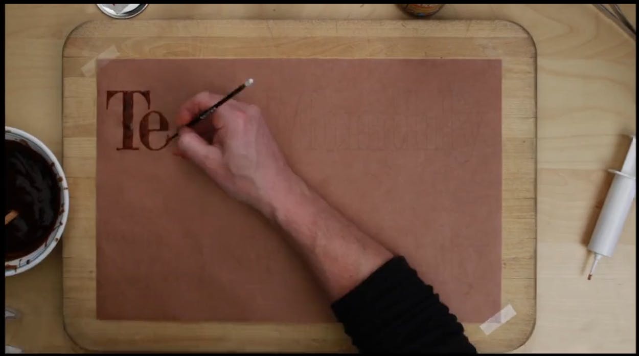
To create the lettering for our June barbecue issue, creative director TJ Tucker spent six long hours playing with barbecue sauce.
Aaron Franklin graciously provided the sauce, and to achieve the right look, we thickened it with agar, an edible hydrocolloid that is used much like flour or cornstarch. It doesn’t sound like it compromised the delectability of the sauce: “At the end, we dipped some sausage in the logo,” Tucker said.
(And as much as we’d like to think that Tucker was able to freehand all the lettering, we need to credit Jon Contino with designing the typeface that is used both on the cover and in the opening spread of the magazine story.)


