


 The passing of Jack Eskridge on Februrary 11 was noted by one of his former employers, the Dallas Cowboys Football Club, which cited Eskridge as the team’s first equipment manager and one of Tom Landry’s very first hires in 1960. But, arguably, Eskridge’s most important contribution to the Cowboys was choosing a blue star to be the team’s logo.
Eskridge’s life was defined by numerous achievements, including witnessing the raising of the flag at Iwo Jima during World War Two, playing professional basketball for the Chicago Stags and the Indianapolis Jets, and coaching basketball as an assistant at the University of Kansas, where he recruited future superstar Wilt Chamberlain. But his simple choice of that star has resonated farther and wider than anything else he did.
It began as a blue star on the side of a white helmet—no white border around the star and not a spec of silver anywhere in the team’s uniform. The Cowboys’s other logo, a cartoon helmeted football player riding what appears to be a freaked-out miniature Shetland pony, was used to promote the team in print ads.
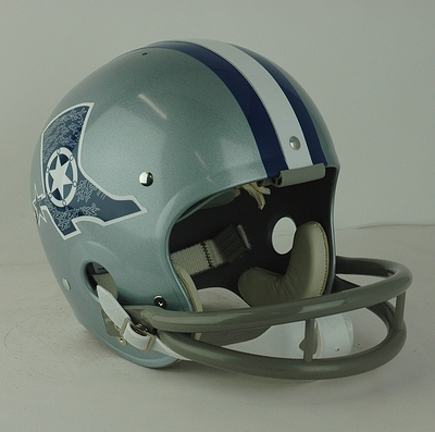
 Before the 1964 season, there was some tinkering with the helmet logo that was credited to Tex Schramm, the Cowboys’ first GM. The team experimented with a Cowboy boot with a star spur logo and considered a blue helmet with a white star, but neither gained traction. When the season started, though, players wore the now-familiar silver helmets with the blue star, which was now outlined in white.
Schramm continued experimenting trying to come up with the right shade of silver, according to Carol Hermanovski, who designed the football club’s new offices at Expressway Towers at 6116 North Central Expressway and redid their bumper sticker to highlight the star.
“I’d meet with him, and he would say, ‘Carol I want to show you something.’ He’d say, ‘What do you think about this color for the leggings for the pants?’ He was obsessing constantly about that silver-blue color. He was so concerned about how that color looked on TV, and of course that was something you couldn’t control because each person’s TV was set differently. He was always trying to get that perfect silver blue. At times he got it a little much like a pale turquoise and I would tell him, ‘No, Tex, it’s got too much green in it. It looks too turquoise.'”
(Here’s a year-by-year evolution of the Cowboys’ look.)
This much is true: Eskridge’s embrace of the star as helmet logo would have been called marketing brilliance, if such a term existed around pro football in the sixties. Of all the brands associated with the state of Texas, none is as well-known and instantly identifiable around the world as that blue star with the white border. No other sports franchise can claim a logo that’s as simple and as instantly recognizable.
Helping to promote the star was the television show Dallas, which by 1980 was the most popular television show in the world, dubbed into 67 languages in more than ninety countries. No matter if viewers understood American culture, much less had an inkling about the city of Dallas—they knew the star, since the opening credits of every episode featured an aerial shot of Texas Stadium, zooming down through the hole in the roof to focus on the end zone where the letters spelled out “COWBOYS,” accompanied by the five-pointed logo. The star said all that needed to be said.
Just think, it could have been that goofy cartoon player riding the midget pony, which is right up there with the oil derrick that ID’ed the Houston Oilers, or that silly patriot hiking the ball that Boston originally embraced.
Or it could have been just a big D, for the first letter of the city the team represented, which of could have been confused for Denver (although today, D might be more appropriate, since it could also be mistaken for Dysfunction, which pretty much sums up the current state of the franchise).
Whatever it represents, it goes back to Jack Eskridge. No matter what one thinks of the Dallas Cowboys, that iconic star represents the team, the city, the state, and NFL football better than any logo in sports.
(Stars from Chris Creamer’s SportsLogos.Net, Boot helmet from Helmethut.com.)
Joe Nick Patoski is the author of THE DALLAS COWBOYS: The Outrageous History of the Biggest, Loudest, Most Hated, Best Loved Football Team in America (Little, Brown). Read an excerpt from it here.
AP Photo/Aaron M. Sprecher


