

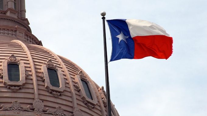

Not every state in the Union has a flag as iconic as the one we have in Texas. (South Carolina’s is basically a palm tree with a crescent moon over it; Washington’s is an ugly shade of green surrounding a portrait of George Washington.) Furthermore, the disparity in the design style used by each state makes it look like they were all created more or less randomly, which they kind of were.
This led the Bressler Group, a Pennsylvania-based design company, to come up with “United We Stand,” a re-brand of every state’s flag using the same basic elements: simplicity; meaningful symbolism; a three-color max; no text or seals; and distinctive, but thematically related, aspects to the other flags. The Bressler’s Group’s Ed Mitchell, who helmed the project, explained the idea in detail in an interview with Wired.
You may be thinking that Texas already gets all of those elements right—which it does—and the Bressler Group’s Ed Mitchell, who helmed the project, agrees. Still, in the spirit of the project, he decided to give the Lone Star Flag a facelift, just for fun:
“The current flag is iconic and doesn’t need to be changed, but because this is a side project I thought it would be fun to conceptually emphasize the lone star on their flag. The goal is to make it even more iconic by enlarging the star.”
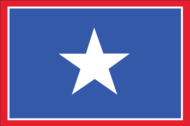

We’ve seen maps of a new Texas before, but this is the first time we can remember a new flag. What do y’all think of the design? Does Mitchell get any points for being so deferrential in explaining why he did the re-design of something that ain’t broke and don’t need fixing?
(h/t FastCo.Create)


