
With Flag Day looming, what better time to wallow in a little vexillology and examine and critique the state of Texas’s flags, from the actual state flag (awesome) on down to some of the couple of hundred or so city and town flags that fly between the Red and the Rio Grande (sadly, most of which are terrible).
Texas is not alone in the awfulness of its city flags. Roman Mars, “the Ira Glass of design” and host of the podcast “99% Invisible,” recently gave a TED Talk entitled “Why City Flags Might Be the Worst-Designed Things You’ve Never Noticed.”
Below the national and state level, Mars believes, “there is a scourge of bad flags, and they must be stopped.”
Mars built his talk around five standards laid down forty years ago by NAVA, the North American Vexicollogical Association:
- Keep It Simple – Mars said the rule of thumb should be that a child should be able to draw it from memory. I would add: could a semi-competent tattoo artist pull it off?
- Use Meaningful Symbolism – Seems simple enough, but are we talking Great Gatsby-style symbolism or The Shining-style symbolism?
- Use Two to Three Basic Colors – These should come from the standard color set: red, blue, yellow, green, black, and white.
- No Lettering or Seals – “If you need to write the name of what you are representing on your flag, your symbolism has failed,” says Ted Kaye, flag design expert. Also, because flags are seen at a distance, nobody can read the messages anyway.
- Be Distinctive or Be Related – The Scandinavian countries show their common distant heritage through similar designs, but are easily distinguishable from one another by their very distinct color palettes. On the other hand, New Zealand and Australia are way too similar.
The, um, standard-bearer for American municipal flags is that of Chicago:
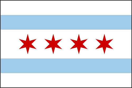

According to Mars, “it has complete buy-in” from the city. It hangs from every municipal building, but more than that, Chicagoans buy products emblazoned with the image and get it tattooed on their skins. Its six-pointed stars pop up in places where the flag might not fit. Some Chi-town cops and firefighters go to eternity in coffins wrapped in this flag, not the Stars and Stripes. “It isn’t just that people love Chicago and therefore love the flag,” Mars says. “I think that people love Chicago more because the flag is so cool.”
That’s what is known as a positive feedback loop, and the same phenomenon applies to Texans and the Lone Star flag. That is because it is an excellent, stellar, amazingly well-designed flag.
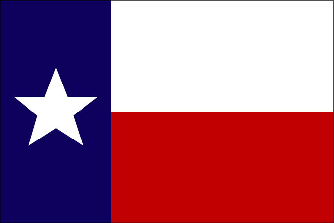

Like Chicago’s, it follows all five of NAVA’s guiding principles. (In 2001, NAVA had it ranked second among all the state and provincial flags in the U.S. and Canada. New Mexico edged us out.) There are three basic colors. Kids can draw it from memory with ease. It is pretty much the American flag boiled down to its essentials: the same basic colors, two stripes instead of thirteen, one star instead of fifty. There’s no writing on it because there doesn’t need to be any. The Lone Star says it all.
And oh, the power of that Lone Star, the source of both our state nickname and the name of the “national beer of Texas.” Texans have come to see themselves as distinct from America, first among people we might regard as equals when feeling charitable. You can’t see the other 49 stars when we come in the room, because we are so busy being bigger and bolder and badder and more awesome than the rest. We also see ourselves as neither Southern nor Western, but something else, something unique, and that something is represented by that Lone Star.
As with the Chicago flag, you see it everywhere, even in places that it is not mandated to be by protocol or law. Sports teams incorporate it into their uniforms. It’s stamped on highway overpasses. Football field–size ones wave over feeder road car lots. It’s ubiquitous in state ad campaigns. Adults get it tattooed on their bodies and kids pledge allegiance to it. It has even inspired its own superhero mythology: “Only the Texas flag can fly at equal or greater height than the American flag,” most Texans believe at some point. Of course, not a word of that is true but we like to believe it anyway.
We alone are stars, and we love that flag and that flag loves us back. It’s our open-source trademark for the most successfully branded state in America, indeed, one of the most successfully branded political entities on earth, and it’s hard to say whether it represents our national character or if it has actually created it.
Which brings us to the sorry state of our city flags. Maybe it is the cause of the sorry state of our city flags. When you’ve got a brand as potent as Texan-ness, maybe El Paso-ness or Lubbock-ness or Beaumont-ness will always come in a distant second. Why bother to come up with a potent symbol? (Just as the opposite holds in the average Chicagoan’s relationship to his city and his state. The former is home, the latter is an endless cornfield full of hayseeds.)
About ten years ago, NAVA ranked 150 American city flags and only three Texas cities cracked the top third.
Highest marks—tenth nationally—went to Corpus Christi.
Maybe a kid would have a hard time capturing all the detail on the seagull, but it does a good job of symbolizing that city and its lovely bay. You could probably ditch the stars, which are said to represent the eight industries that drive the economy. And what might those be? It depends, the city says.
You don’t even have to say which city this is, and yet until a few years back, when NAVA informed of them of their standard against writing, San Antonio did just that right there on this flag. Without the lettering, I would rank it higher than Corpus. Still, it’s not as great as the Texas or Chicago flags because it is incorporating an icon rather than the embodiment of one. But if you have an Alamo in your town, that is just what you have to do.
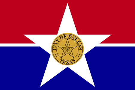

Dropping down to number 21, there’s Dallas, with what NAVA regards as the best in Texas of what is known in the trade as an “SOB flag.” That stands for municipal “seals on a bedsheet.” Several of the older big cities in Texas fly these, and Mars hates them.
“Here’s the thing about municipal seals,” he said. “They were designed to be on little pieces of paper. Not on flags, flapping in the breeze, a hundred feet away.”
Dallas evidently scored relatively well thanks to its mild, Tripping Daisy–level of psychedelia: there’s a lone star, within a lone star, like, within another lone star, man.
And after that’s there’s a huge drop-off to number 55: Houston, where the flag dates back to 1840, when the city was all of four years old. Just as we don’t allow pre-K kids to get inked up, we should not allow toddler cities to attempt to brand themselves for all eternity.
Although a locomotive is the dominant element here, this represented an invitation more than a reality: no train would churn into Houston until years later. And although trains did play an important role in the development of Houston and continue to be a vital part of the economy today, they are widely loathed for all the traffic snarls they cause.
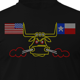
James Glassman, a.k.a. the Houstorian, has come up with many better designs on his Houston-themed T-shirts. For a new flag, I am partial to this one:

Moving on…

Austin (number 62) has another SOB flag. Ironic that what is arguably Texas’s most heathenish city sports a cross on its seal and flag, but is that a bong underneath? Or a genie’s lantern? (With Austin as the state capital, and Texas flags flying everywhere, I bet this flag gets the least exposure of any of the big city banners. It certainly is hard to find on the web. And the origin of that cross is reportedly in the family crest of Stephen F. Austin.)
El Paso (number 91) looks more like an outlaw biker gang’s cut. Have you cleared that bottom rocker with your local Bandidos, El Paso?
The Metroplex’s burbs abound in flags that remind some people of gas station logos. NAVA only rated a couple of them: Arlington’s (number 58) is the seventh flag over Six Flags. I am not sure which of these came in eighty-sixth place for the city of Garland.
They remind me more of the corporate real estate banners you see hanging out in front of the model home in a master-planned community, or by the leasing office of a big ol’ Trammell Crow apartment complex. Here are a few more:

Enough of that. On to the stylistic outliers.
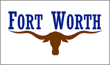
Fort Worth’s modern-day flag was not highly-regarded by NAVA, ranking sixty-seventh. In a world where the University of Texas Longhorns did not exist, Fort Worth could take the lettering off this flag and have a killer symbol for Cowtown. But we don’t live in that world, and if they didn’t put Fort Worth on this flag, it would just be something the Horns would be waving around on Saturday afternoons in the fall.
At any rate, this came as the replacement (a couple of intermediates removed) for one of the most, um, astounding and, er, exuberant flags ever to fly over a city in Texas or America or anywhere else for that matter.
I speak of the Fort Worth flag of 1912.
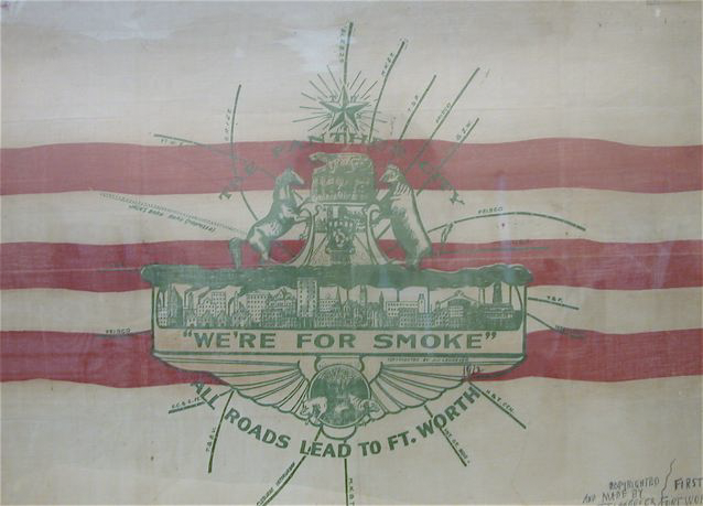

Like that of Milwaukee, this is what Mars would call a “kitchen sink” flag. It’s got a little something for everybody in there. There are no fewer than three modes of written expression, for starters. There’s a descriptionFort Worth was once known as “the panther city,” because those great cats were known to slumber in the city streets, according to one legend. There’s a boast, about all those roads leading to the city. And there’s an exhortation: “We’re for smoke” is an invitation for industrialists to come on down to Fort Worth and bring their polluting smokestacks with them. (In modern terms, it’s like a city stitching “Come Frack Us” on their flag today.)
And we’ve only just begun here. There’s the skyline of Fort Worth: already choking in black clouds of poison, but evidently nowhere near enough of them for the people who hoisted this flag. There is a weird little menagerie of animals: the panther, a horse, a winged sphinx, and oddly, a sheep but no steer. Seventeen roads lead in to this vexicollogical vortex of disaster, all of it topped by a lone star, naturally. Oh yeah, and there are some stripes back behind there too. The whole thing looks like it was designed by three solemnly inebriated business majors.
But the worst flag in modern-day Texas belongs to Lubbock, at least according to NAVA’s rankings, which had this terrible banner at number 144. But that was not Lubbock’s official flag.
This one is, and it is almost as bad as the cheesy monstrosity above. I mean, it’s just a Texas flag with a Texas Farm-to-Market Road sign on it. Step it up Lubbock. How about a white field with nothing but a pair of Buddy Holly glasses?
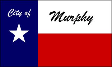
At least it’s not as brazen a rip-off as Murphy’s:
We’ll close with a few more that stand out from the pack.
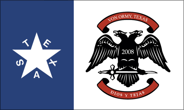
The seven-year-old town of Von Ormy kicks it old school with this hybrid of what looks like the banner of a Dark Ages European warlord and Lorenzo de Zavala’s Texas Republic banner. It’s a complete mishmash, but I still dig it.
And then there’s Denison, a small town with a neat flag. Way back in 1873, they grasped all of NAVA’s guiding principles. It’s simple. There are a bit too many colors but they are all basic, and there is no writing nor a seal. The symbols are all meaningful: The green band represents the grasslands in the nearby Indian Territory, the red is the Red River that divides Denison from those prairies, and the white an ocean of Texas cotton in which Denison was situated. That vertical black bar is the MKT Railroad, and Denison is the lone star smack-dab the middle of it all. Nicely done, Denison.
(Photos: Wikipedia / Wikimedia Commons: all, save for 1912 Fort Worth flag: Don Young/FWCANDO.org)


