No, your eyes are not deceiving you. And no, there’s no need to doublecheck the URL at the top of the screen. This is, indeed, www.texasmonthly.com. It just looks a lot different than it used to. Better, we hope. Sharper. Livelier. Friendlier. Texas-ier.
What you’ll see as you poke around the site is a design that’s been rethought almost from the bottom up. But as gorgeous as we think it is, don’t let the striking visuals distract you from something else: we’ve revised our entire editorial operation from the bottom up, too.
Last summer, the team at Texas Monthly embarked on the task of overhauling the print magazine and the website. What followed was a series of conversations in which we sussed out what we wanted to see in a refurbished Texas Monthly. These conversations focused on our content—Which subjects do we need to cover more? Which should we cover less? What should we cover differently? We asked questions about the magazine’s and website’s organization and presentation as well—Do our current designs guide readers clearly? Do they point readers toward the stories they’re most interested in reading? Can we integrate them better with our increased emphasis on live events, podcasts, newsletters, and video? If all that sounds a little wonky, we also asked ourselves: Is what we’re doing beautiful? Is it beautiful enough?
They were great conversations—spirited, engaging, provocative, and only rarely contentious (our bottomless office supply of Topo Chico salved all wounds). And though everyone here has long been proud of the work we do, as we talked we realized that we wanted to engage in more-radical change than any of us expected when we started down this path.
Like many legacy publications, Texas Monthly has, in recent years, maintained two largely distinct staffs for print and web. There was some overlap; all of our print writers contributed to the web (though few of them frequently) and some of our web writers contributed to the magazine (though few of them frequently). The same was true for our editors, who only occasionally crossed over that self-imposed border. In 2018, we realized, this no longer made any sense, if it ever did.
At the same time, we had another problem. Virtually every editor at Texas Monthly has been a general editor. That is, each of us edits every kind of story—stories about music and stories about politics and stories about food. This made sense when Texas Monthly was a standalone print magazine with a finite amount of space. There was only so much we could cover, and we didn’t pretend to be an encyclopedic resource for all things Texan—just a smart, stylish one. So all of us did a little bit of everything.
Today, though, Texas Monthly is a web presence as well as a print presence, and the demands and capacity of the web are infinite. There’s now a great need for us to weigh in on a daily basis on many things. Which means we need editors whose job it is to stay on top of, say, music, politics, or food.
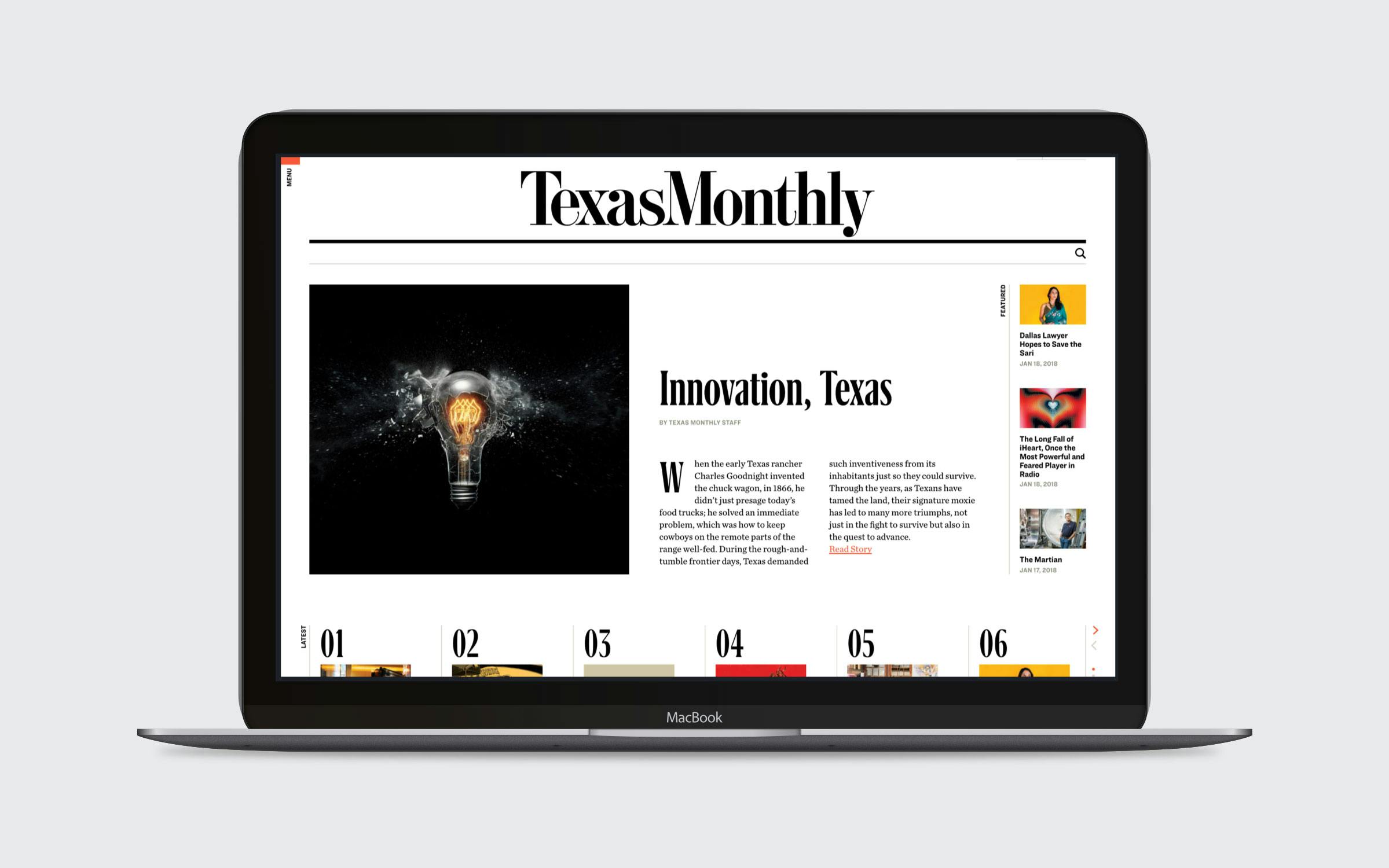
So we’ve reorganized our editorial team into what media types refer to as verticals. Take a look at the top of this page and you’ll see them. There’s News & Politics, Being Texan (Texana, Texas history, personal essays from Texans, and, of course, the Texanist), the Culture (the arts, sports, religion, and more), Style & Design, Food & Drink, BBQ (yes, barbecue is so popular that it has its own vertical), and Travel & Outdoors. Each of those verticals will now have a specific editor assigned to it.
The previous iteration of our website was organized in a somewhat similar fashion; the biggest change is that the editorial team and the print magazine are now organized that way as well. If you look at the February issue of Texas Monthly—our 45th anniversary issue, by the way—you’ll see that the entire front of the book has been turned over to the verticals listed above; gone are loosely defined rubrics like “Reporter” (which, in any given month, might have contained stories about environmental disasters and Dallas musicians and the latest Larry McMurtry novel) and “Columns” (which, in any given month, might have contained stories about environmental disasters and Dallas musicians and the latest Larry McMurtry novel). In their place are clear labels that will help readers interested in stories about environmental disasters (or Dallas musicians or the latest Larry McMurtry novel) get to them as quickly as possible.
That those exact same labels are found here on the website means that our print and online editions are now aligned. Whether you’re leafing through our pages or scrolling through our pages, you’ll feel like you’re reading Texas Monthly.

And when it comes to the magazine and the website we can now answer, with great confidence, Yes, they are beautiful enough. In both mediums we’ve done a great deal of work to make Texas Monthly visually more appealing. Most noticeably, we’ve brought in new typefaces and added more white space to allow our gorgeous photos and illustrations to shine. Words are still important—of paramount importance—to us, but readers will no longer be faced with the monolithic walls of type that too often dominated our layouts.
Other changes are more subtle, but no less important. “Our previous site was lacking in visual hierarchy and variety,” design director Emily Kimbro recently noted. That feeling was shared by director of digital strategy Brett Bowlin, who has been the in-house workhorse on the digital redesign. “Many of the web pages and structures lacked a certain amount of priority in presentation,” he said. “A lot of our pages felt like one big ‘Pinterest’ board; all our stories carried the same weight.” It was tough to tell which of our stories were really important when most of our webpages had a similar look that quickly grew tiresome. The site you’re looking at now, we hope, will do a better job of keeping your eye and your interest engaged.
All of this is the result of a lot of hard work by a lot of people: Bowlin and Kimbro, for sure, but also digital art director Anna Donlan, senior editor Abby Johnston, and Upstatement, the Boston-based digital design studio we hired to help us out with much of the heavy lifting. And, of course, the entire editorial and art staff of Texas Monthly who, in this still-new year, have had to pull the weeks-long equivalent of an all-nighter to learn how to use our new system and do our new jobs.
The result of all this hard work is a magazine and website that abides by and transcends the ambitions of Texas Monthly’s founders. At least, that’s what we think. Ultimately, the opinion that matters the most is that of our readers, both the many new readers we hope to attract with this redesign and the folks who have been with us since day one, back in 1973.
To all of you: Please look through the magazine and the website—there’s a lot to see—and tell us what you think. Even today, as we crossed our fingers and let this baby out into the world, we spotted things we want to tweak. And we will, quite soon. Texas Monthly Redesign 1.1 is just around the corner. We’re counting on you to help us make it even sharper, livelier, and friendlier. And Texas-ier.


